
Retail Signage That Converts: A 2026 Guide to Placement and Proof
Most in-store signage fails before a shopper reads a word, because it fights how people actually move through a building. Here's how to place it, design it, and prove it worked.

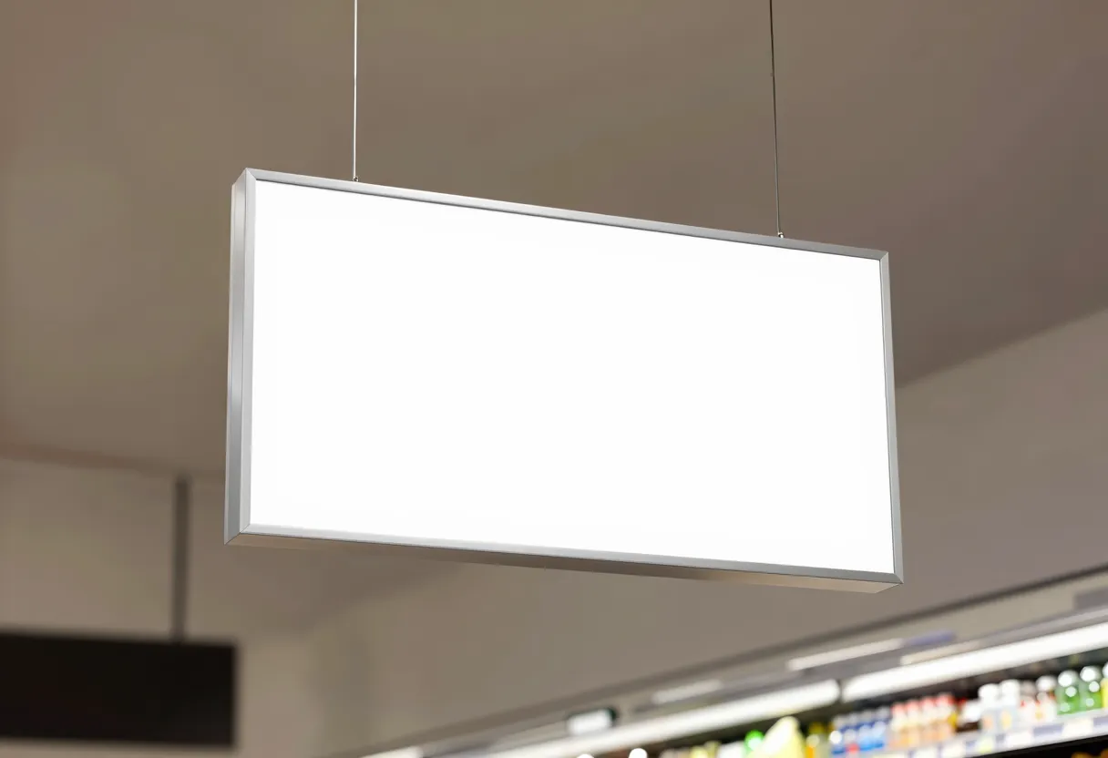
Key takeaways
- Signage placed in the first 10-15 feet of a store entrance is largely wasted; shoppers are in a 'decompression zone' and aren't absorbing messages yet.
- Legible signage follows a strict hierarchy: one offer, one benefit, one brand cue, readable in under two seconds from a walking distance of 6 to 10 feet.
- Placement should work with traffic flow, not against it: endcaps facing the direction shoppers naturally turn convert better than signs facing a dead wall.
- Signage ROI is measured through matched-store lift tests, not clicks: compare sales in signed locations against unsigned control stores over the same period.
- Treat signage like a media buy with a brief, a hierarchy rule, and a measurement plan, not a design afterthought handed to whoever has Canva open.
The Three Seconds Before the Sale
Walk into the Sobeys on Grant Avenue on a Saturday morning and watch the first ten feet past the doors. Nobody is reading anything there. Shoppers are still shifting out of parking-lot mode, adjusting their eyes, checking a list on their phone. Retail anthropologist Paco Underhill spent decades documenting this exact pattern through his research firm Envirosell, and gave it a name that has stuck in retail design circles ever since: the decompression zone, described at length in his book and in a widely cited profile of his work in The New Yorker's account of his research.
Put your best offer in that zone and you have spent budget on a wall nobody actually processes. This is the part of retail marketing most brands still treat as decoration rather than a channel with its own placement logic, its own legibility rules, and its own way to prove it worked, the same discipline we push in our out-of-home formats and costs guide for anything a person walks or drives past.
Signage that converts is not the signage that looks best in a rendering. It is the signage designed for a person moving at roughly three feet per second, glancing sideways, deciding in under two seconds whether to slow down. Everything below follows from that one physical fact.
How Shoppers Actually Move Through a Store
Underhill's Envirosell studies, tracked across thousands of hours of in-store video across North America, also documented what retail designers now call the invariant right: in stores without a strong architectural cue pulling them the other way, most shoppers entering a store turn right. That single behavioral bias shapes where the highest-value real estate in a store actually sits, and it is rarely the wall directly opposite the front door.
The rest of the path is shaped by what retail planners call the power aisle, the perimeter route that carries the heaviest traffic because it connects entrance to essentials. Endcaps along that route see meaningfully more eye contact than mid-aisle shelf tags simply because they sit on the path shoppers already take, not a path you are asking them to detour onto. Signage strategy, in other words, starts with a traffic map, not a design brief.
Legibility and Hierarchy Rules That Survive a Moving Shopper
The U.S. Access Board's federal signage guidance, built for accessible wayfinding, embeds a principle worth borrowing even where compliance isn't the goal: character height has to scale with viewing distance, because legibility isn't a fixed size, it's a ratio. A sign readable at a store's front doors is often unreadable from the far end of an aisle, and most retail signage gets sized for the mockup on a laptop screen, not for the six to ten feet a shopper actually stands from it.
Hierarchy matters more than any single design choice. A moving shopper's eye grabs one dominant element, then maybe a second, then almost never a third. Signage built by committee tends to cram in a logo, a tagline, a price, a QR code, and a disclaimer, all fighting for the same half-second of attention. None of it wins.
- One offer per sign. If you have two promotions, you need two signs in two zones, not one crowded panel.
- Contrast beats color. Dark text on light background (or the reverse) reads faster at a glance than any brand-palette pairing with similar luminance.
- Cap the word count at eight to ten words for anything meant to be read while walking; save paragraphs for signage placed where people pause, like a checkout line.
- Put the benefit above the brand. Shoppers decide whether to slow down based on what's in it for them, not whose logo is on the sign.
- Test print, not screen. A layout that looks balanced on a monitor at arm's length often collapses at aisle width; proof it on the floor before the full run prints.
Placement Against the Grain of Traffic
Placement is where most in-store signage programs quietly fail, because the decision usually gets made by whoever has wall space available that week, not by anyone looking at how people actually flow through the building. A sign facing away from the dominant traffic direction is a sign facing empty air for most of the day.
- Endcaps: place the primary message on the end facing the direction of the power aisle traffic, not the end facing a service corridor.
- Wayfinding signage: cluster it at decision points, not mid-corridor; a shopper needs direction where the path forks, not halfway down a straight aisle.
- Point of purchase displays: put them at the last decision point before checkout for impulse categories, and near the relevant shelf for considered categories.
- Checkout zones: this is the one place shoppers are stationary and reading, so it's the right spot for slightly denser copy, loyalty program cues, or a secondary offer.
- Window and entrance signage: reserve this for brand recognition and category cues only; save the hard offer for the zone past the decompression buffer.
This same logic scales up to the parking lot and the street. A fleet graphic parked facing the wrong direction on a delivery truck is the outdoor version of the same mistake: cheap media that nobody's eyes actually cross. Placement against real traffic flow, indoors or out, is the difference between an impression and a wasted print run.
Measuring Signage ROI Without a Click
Signage has no pixel to fire and no UTM to parse, which is exactly why so many marketing teams stop measuring it once budget season shifts toward channels that report themselves automatically. That's a mistake worth correcting, because the measurement methods for signage are old, proven, and don't require new martech.
of purchase decisions were made at the shelf, per POPAI's Shopper Engagement Study
POPAI, now the Path to Purchase Institute, 2012
The workhorse method is a matched-store test: run the signage program in a set of stores that resemble your full network in size, format and demographics, keep a comparable set of stores unsigned as a control, then compare unit sales or category velocity across the same weeks. It is the same difference-in-differences logic used for regional media tests, and it produces a defensible lift number without needing a single click.
Traffic and dwell-time counters, the kind many retailers already have installed for security or headcount, add a second layer: did more people stop near the display, and for how long, compared to a period before the signage went up? Pair that dwell data with POS lift and you have a measurement stack that stands up next to any digital report, the same rigor we've laid out in our breakdown of marketing attribution models for 2026 budgets, just applied to a channel that doesn't hand you a dashboard by default.
What to Do This Week
Signage keeps losing budget arguments to channels that self-report, which is exactly the pattern our recent 2026 budget poll of 30 marketing leaders picked up: physical channels get cut first when nobody in the room can produce a lift number on demand. Fix that before the next budget cycle, not during it.
- Walk your top three locations and time how far a shopper travels before your first sign appears; if it's inside 15 feet of the entrance, move it.
- Pick five stores for a matched-store test this quarter and hold a comparable set as control before your next signage refresh.
- Cut every sign down to one offer, one benefit line, and print a full-size proof to check readability at six feet before the production run.
- Reface your worst-performing endcap to face the direction your traffic data says people actually walk, not the direction that's easiest to install.
A sign nobody reads is not cheap. It's just unmeasured.Danielle Cardinal
Bring the same rigor to every physical channel you run.
Frequently asked questions
Effective signage matches how a shopper actually moves: one message, high contrast, readable in under two seconds from six to ten feet away, and placed outside the decompression zone near the entrance where people aren't yet absorbing information.
Place primary offers along the power aisle and at endcaps facing the dominant traffic direction, put wayfinding signage at decision points like aisle intersections, and reserve denser copy for checkout zones where shoppers are stationary long enough to read it.
Run a matched-store test comparing sales in signed locations against a similar set of unsigned control stores over the same period, and pair that with traffic or dwell-time data from in-store counters to confirm the signage actually changed shopper behavior, not just coincided with it.
Size text to the viewing distance of the zone it sits in, not to how it looks on a screen. A sign near an entrance needs larger, simpler type readable from several feet away, while checkout signage can carry smaller, denser copy because shoppers are standing still and closer to it.
Advertiser disclosure: some links in our articles are affiliate links, and CMO Mag may earn a commission or referral fee if you sign up or buy through them, at no cost to you. It never affects our editorial coverage. See our advertising & affiliate policy.
More in Physical Marketing
View all
Fleet Graphics Are Advertising's Cheapest Impression. On Paper.
Wrapped vans really are among the cheapest ways to reach people. The catch is the impression math behind that famous sub-dollar CPM.
Discussion
No comments yet. Be the first to say something worth reading.